Visual Web Engineering
Edit the page you already have, then hand the change off properly.
Tweakwright turns a live website into a working design surface. Inspect the real DOM, make reversible variations, check them across screen sizes, and export the result for implementation or review without rebuilding the page from a screenshot.

The problem
A small website change usually gets translated three or four times before it ships. Someone circles a screenshot, a designer recreates the section in a design file, a developer finds the real element in DevTools, and then everybody checks whether the implementation still matches the thing that was approved.
The translation is the expensive part. Screenshots lose the DOM, design files lose the live responsive rules, and DevTools edits disappear as soon as the page refreshes. The more complex the page, the easier it is for spacing, typography, responsive behaviour or an SVG detail to drift between the original, the proposed change and the final handoff.
What we built
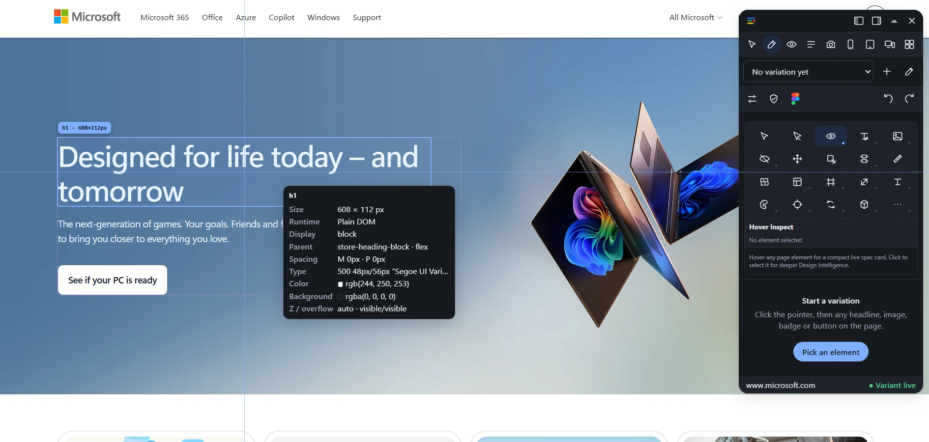
Tweakwright works directly on the live webpage. Point at an element and it reads the real structure and computed presentation around it: dimensions, display mode, parent context, spacing, typography, colour, background and overflow. Select the element and the same panel becomes the place where the variation is made.
Edits live in named variations instead of replacing the original. That makes comparison, responsive review and rollback part of the workflow rather than something reconstructed later. When the variation is ready, Tweakwright Studio carries the same edit history into review, QA and export instead of asking the next person to reverse-engineer what changed.
How it works in practice
Inspect the real page
Hover and select elements on the live site instead of working from a flattened screenshot. The inspector exposes the measurements and presentation details that matter when a design has to survive implementation.
Variations, not destructive edits
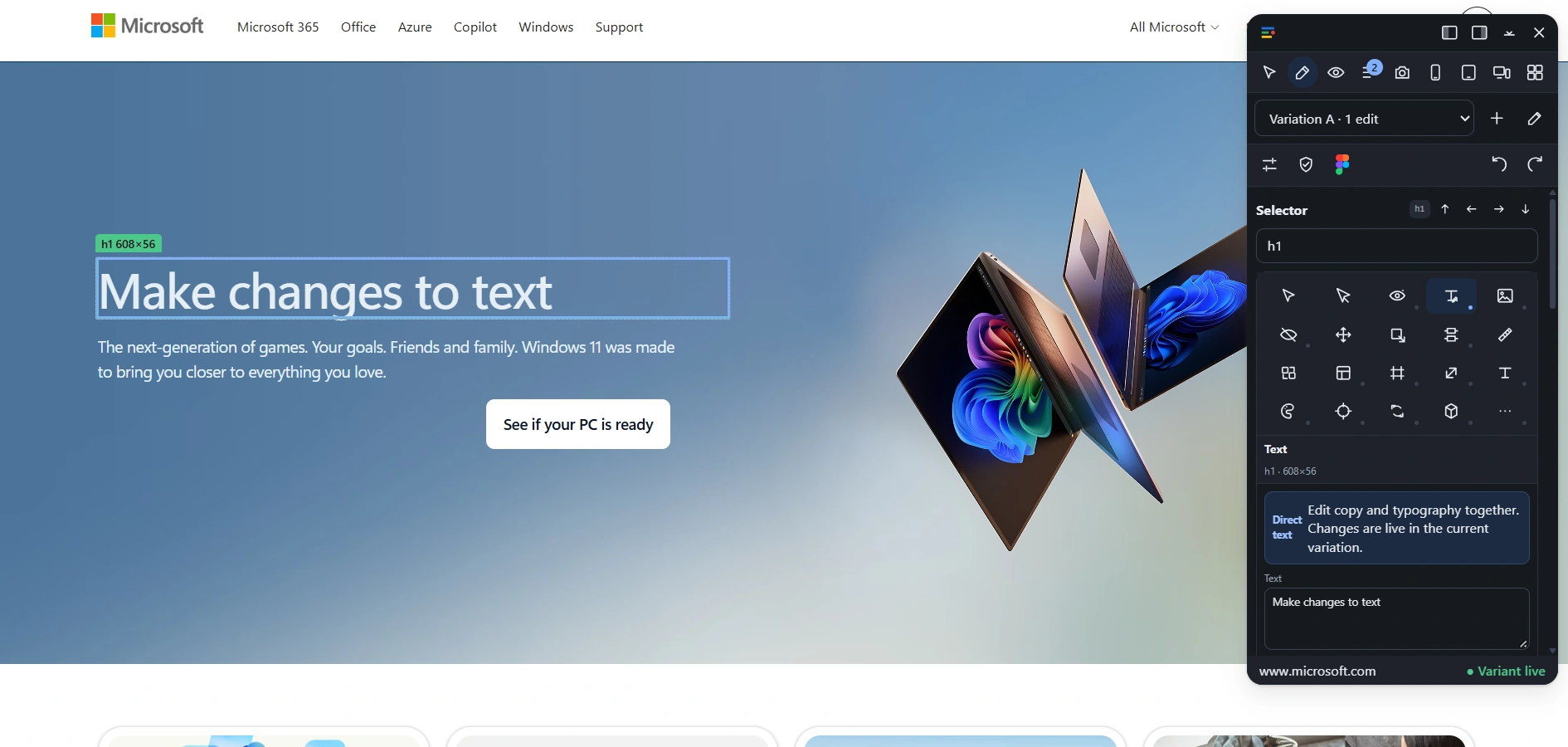
Create a named variation, change copy or presentation, compare it with the original and keep the edit count visible. The base page remains the reference point, so experiments stay reversible.
Responsive review in context
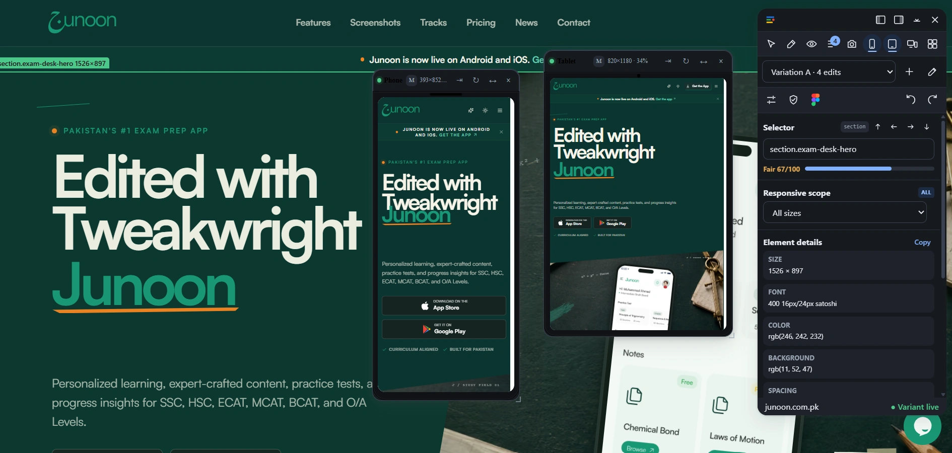
Check a variation at phone, tablet and desktop sizes while the live page and the selected element stay in view. Responsive scope can be applied deliberately instead of discovering breakpoint problems at the end.
A Figma ground-truth path
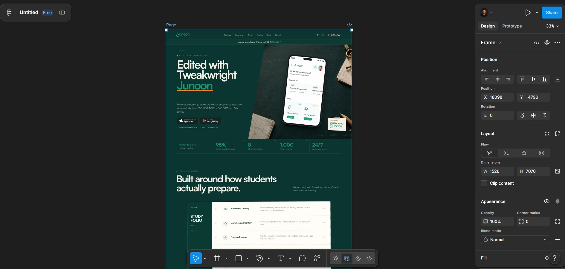
Tweakwright can carry a captured webpage into Figma as a structured review scene, giving design review a closer relationship to the live page than a manually redrawn mock-up.
Handoff for the stack that owns the page
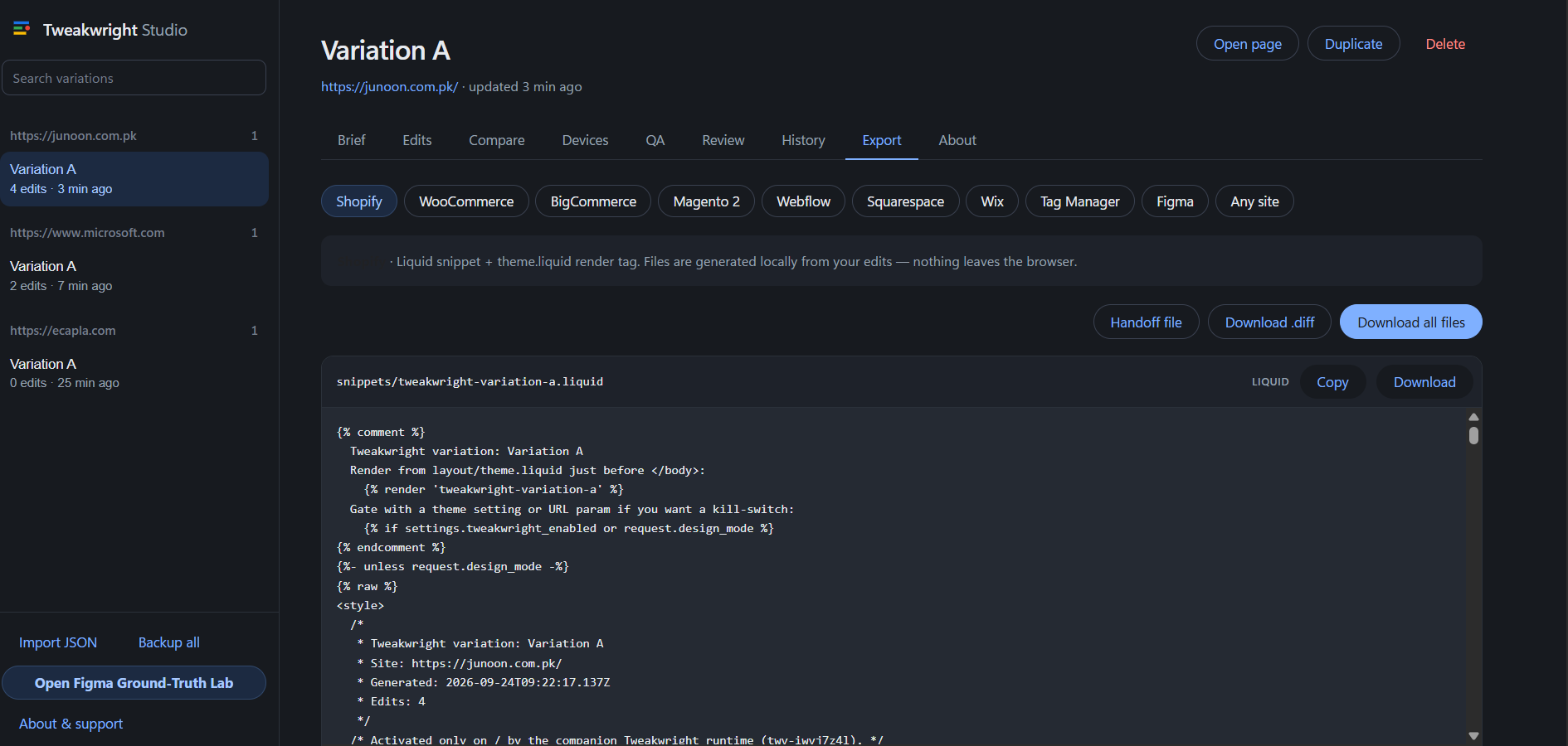
Studio exposes export paths for Shopify, WooCommerce, BigCommerce, Magento 2, Webflow, Squarespace, Wix, Tag Manager, Figma and a general site workflow, alongside handoff files and downloadable diffs.
Local export generation
The export workspace generates files locally from the variation. The site being edited does not have to be copied into a separate hosted editor just to produce the handoff.
How it works
Open Tweakwright on the page, start a variation and pick the element that actually needs changing. The browser overlay handles selection and inspection; the variation records the edits; device review checks what those edits do at other sizes.
Studio then becomes the audit trail. Brief, edits, comparison, devices, QA, review, history and export sit against the same variation, so the approved change and the implementation handoff remain connected instead of becoming separate artefacts with separate assumptions.
What is next
- Keep tightening difficult visual-fidelity cases such as typography, SVGs and complex responsive sections against ground-truth captures.
- Expand implementation adapters and review automation without turning the workflow into another hosted copy of the customer's site.


Want something like this for your business?
Tweakwright started as a problem we could not buy a decent answer to. If you are looking at one of those, tell us about it.